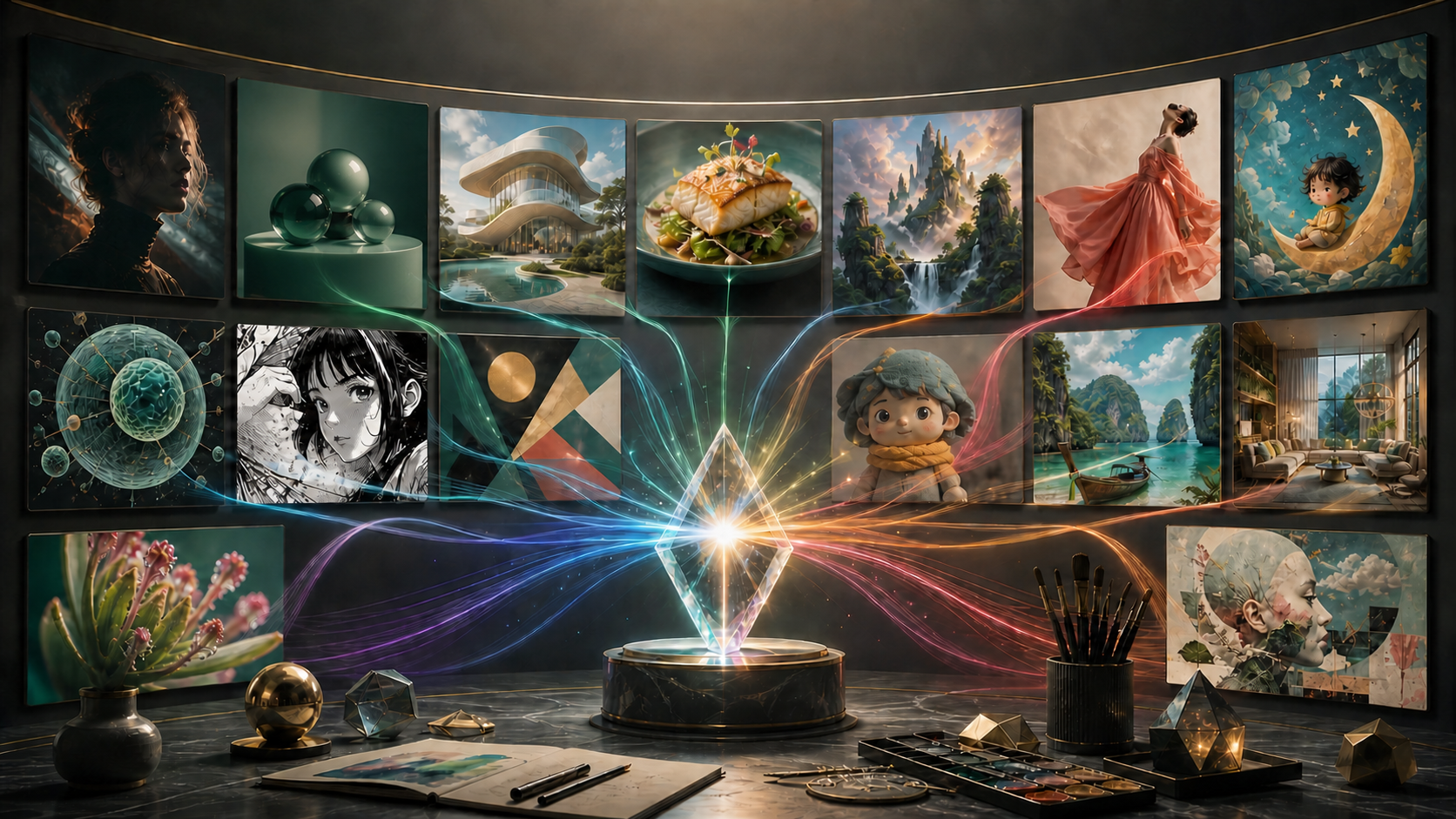
The best GPT Image 2 prompts are not the longest or the most poetic. They are the prompts that define a clear job, give the model enough visual information to make good decisions, and tell it which details must survive the result.
OpenAI's current image model can generate and edit visuals, render structured layouts, work with text, and participate in multi-turn revisions. That does not mean every idea needs a wall of camera jargon. A successful brief usually contains five things: purpose, subject, composition, visual language, and constraints.
Below are fifteen original prompts you can copy and adapt. Each example includes an explanation, useful variables, and a focused revision. The set covers both artistic experimentation and production tasks, because an impressive image is most valuable when you can actually use it.
Before you copy a prompt
GPT Image 2 is the API model name, while ChatGPT Images 2.0 is the consumer product experience. The core prompting principles apply to both, but controls and output behavior can differ. ChatGPT lets you create and edit conversationally; the API exposes generation and edit workflows with model parameters.
As of August 2026, the official API documentation supports custom GPT Image 2 resolutions within defined constraints, as well as standard square, landscape, and portrait sizes. In ChatGPT, you can request an aspect ratio directly. Treat resolution, quality, and cost as deployment choices rather than stuffing every technical parameter into prose.
One more practical distinction: OpenAI's ChatGPT help page says the product can follow transparent-background requests, but the current API documentation says gpt-image-2 does not support a forced transparent background. If transparency matters, test the exact surface you use and keep a background-removal step available.
The prompt framework that travels well
Use this order:
Purpose and format + main subject + action or relationship + composition + lighting and color + medium or style properties + exact text, if any + fixed constraints + things to avoid
You do not need every field for every image. A one-object product shot may need materials, light, angle, and background. A comic page needs panel order, character anchors, actions, dialogue, and reading direction.
Write facts before adjectives. “Three-quarter view of a matte ceramic radio with two brass dials” guides the model more than “an unbelievably gorgeous futuristic radio.”
Six rules for stronger GPT Image 2 prompts
1. State the job
“Create a 4:5 social ad concept” is more useful than “make art.” Purpose helps the model choose hierarchy, negative space, and detail.
2. Describe spatial relationships
Say where important elements belong: subject in the lower center, headline area in the upper third, background horizon below eye level, or three products arranged from tallest to shortest. Spatial direction reduces random composition.
3. Define the medium with properties
Do not stop at “watercolor” or “anime.” Add the qualities that matter: soft granulating washes on cold-press paper, crisp ink contours, two-step cel shading, or simplified painted backgrounds.
4. Separate exact text
Put required copy in quotation marks and say it must appear verbatim. Keep it short, specify hierarchy, and proofread the output. Improved text rendering is not permission to skip review.
5. Name invariants
For editing and continuity, say what must not change: identity, pose, product geometry, camera angle, palette, copy, or background objects. Positive preservation instructions are often more actionable than a huge negative list.
6. Revise one variable at a time
If the result is close, do not rewrite the entire brief. Change the light, framing, copy, or object placement while preserving approved elements. Versioned iteration teaches you which instruction caused the improvement.
1. Cinematic editorial portrait
Use this when you need a fictional editorial subject with believable lighting and emotional specificity.
Prompt:
Create a vertical 4:5 cinematic editorial portrait of an entirely fictional adult ceramic artist in a quiet workshop at dawn. Frame from mid-torso upward in three-quarter view, subject positioned slightly right of center, looking toward a shelf of unfinished vessels rather than at the camera. Warm window light brushes the left cheek and hands; cool blue ambient light fills the room. Preserve natural skin texture, subtle under-eye detail, flyaway hair, clay dust on a charcoal apron, and restrained expression. Photographic realism with a gentle 50mm perspective, moderate depth of field, soft highlight roll-off, muted earth palette, and fine film-like grain. Keep the background readable but secondary. No glamour retouching, plastic skin, distorted hands, extra fingers, text, logo, watermark, or identifiable real person.
Why it works: it defines a profession, action, gaze, light relationship, palette, and emotional temperature. “50mm perspective” communicates a natural editorial feel, but remember that camera terminology is descriptive guidance, not a guarantee of optical simulation.
Customize: occupation, location, time of day, gaze direction, wardrobe, dominant and accent colors, and crop.
Focused revision:
Preserve the subject, pose, workshop, apron, camera angle, and all facial details. Change only the mood from reflective to quietly optimistic by lifting the gaze slightly and adding a small natural smile. Keep the lighting and color grade unchanged.
2. Clean product hero image
Use this for an unbranded concept object, marketplace placeholder, or early art direction—not as proof of a product that does not exist.
Prompt:
Create a square studio product photograph of one original, unbranded portable speaker. The speaker is a low rounded rectangle made from deep forest-green anodized aluminum, with a cream woven grille and one plain brass volume dial on the top-right edge. Place it on a seamless warm-gray surface, camera at a low three-quarter angle, object occupying 65 percent of the frame. Large softbox light from upper left creates a broad controlled highlight; a narrow rim light separates the right edge; subtle contact shadow anchors the product. Show accurate metal, fabric, and brass material behavior with clean product geometry. Premium restrained commercial photography. No label, logo, lettering, screen, cable, fingerprints, duplicate objects, floating parts, harsh reflection, watermark, or decorative text.
Why it works: material, geometry, scale, angle, and light are explicit. The negative constraints protect the blank product rather than asking the model to invent a brand.
Customize: material, form, surface color, hero angle, background tone, and shadow softness.
Focused revision:
Keep the speaker design and camera position identical. Replace only the warm-gray background with a pale sand backdrop and make the contact shadow 20 percent softer. Do not alter the product color, grille, dial, proportions, or reflections.
3. Product lifestyle scene
Use lifestyle composition when context matters as much as object clarity.
Prompt:
Create a landscape 3:2 editorial lifestyle photograph of the same original forest-green portable speaker on a sunlit picnic table beside a folded cream linen napkin, two apricots, and a clear glass of water. Late-afternoon light passes through tree leaves, creating a few soft moving-shaped highlights without obscuring the product. Camera at seated eye level, speaker in the left third, open negative space on the right for optional layout. Background is a softly blurred meadow with no people. Preserve the speaker's exact rounded rectangular shape, cream woven grille, single brass dial, and unbranded surfaces. Natural materials, believable scale, slightly warm color grade. No label, logo, text, extra speaker, warped table, duplicate fruit, impossible reflections, or watermark.
Why it works: it connects a product to a use moment while declaring which product features are invariant.
Customize: context, supporting props, season, light, and copy space.
Production note: exact commercial products should be composited or verified against approved photography. AI should not silently change safety features, packaging, or claims.
4. Architectural concept rendering
Use this for atmosphere and early design exploration, not construction documentation.
Prompt:
Create a wide 16:9 architectural visualization of a small public reading pavilion beside an urban wetland. The building consists of two low curved timber volumes connected by a transparent central passage; a continuous accessible ramp rises gently from the path; a broad roof collects rainwater into a visible planted channel. Show the pavilion at early evening with warm interior light and a cool overcast sky. Eye-level viewpoint from across the wetland, foreground reeds framing the lower edge, people represented only as small generic scale figures. Contemporary biophilic architecture, realistic timber, glass, stone, water, and native planting. Maintain plausible structure, circulation, guardrails, and human scale. No impossible cantilevers, blocked ramp, fantasy materials, signage, logos, text, watermark, or imitation of a specific architect.
Why it works: the prompt describes program, massing, access, water behavior, viewpoint, and atmosphere—not only “futuristic building.”
Customize: program, climate, materials, accessibility feature, landscape, and time of day.
Review: have qualified professionals validate codes, structure, drainage, access, and safety. A polished render is not an engineering drawing.
5. Interior design visualization
Use this to explore a coherent room rather than a collage of trendy furniture.
Prompt:
Create a landscape interior visualization of a compact apartment living room designed for reading and quiet conversation. Room is 4 meters wide with one tall north-facing window on the left wall. Place a low oat-colored sofa against the back wall, two dark walnut lounge chairs facing inward, a round travertine table between them, and built-in bookshelves on the right. Use limewashed warm-white walls, medium oak floor, charcoal wool rug, one sculptural paper pendant, and three leafy plants of different heights. Soft cloudy daylight enters from the left; small amber lamps add evening warmth. Balanced asymmetrical composition from the doorway at standing eye level. Believable clearances and furniture scale, tactile restrained realism. No television, fireplace, excessive decor, duplicate furniture, warped shelves, text, logo, or watermark.
Why it works: room dimensions, light source, layout, palette, and circulation are defined. That prevents a generic showroom composition.
Customize: room size, window position, functional need, material palette, furniture count, and viewpoint.
6. Editorial food photograph
Use this when texture and presentation must remain appetizing without becoming implausibly perfect.
Prompt:
Create a vertical 4:5 editorial food photograph of roasted miso-glazed eggplant over sesame rice in a shallow handmade ivory bowl. Two eggplant halves lie diagonally from lower left to upper right, glossy but not oily, topped with thin scallion curls and toasted sesame. Show distinct rice grains, a small pool of dark glaze, and light steam. Place the bowl on a worn dark-wood table with one folded indigo napkin in the background. Soft directional window light from the right, gentle shadow on the left, close three-quarter viewpoint, focus across the front eggplant with gradual falloff. Natural appetizing color, subtle imperfection, restaurant editorial styling. No cutlery crossing the food, duplicate garnish, impossible steam, raw ingredient mismatch, label, text, logo, watermark, or hands.
Why it works: it specifies serving vessel, orientation, garnish, textures, light, and what should not crowd the hero food.
Customize: dish, plating geometry, surface, prop count, light direction, and crop.
Accuracy note: do not use a generated image to represent an actual menu item unless it truthfully matches what customers receive.
7. Epic fantasy environment
Use this for worldbuilding with clear geography rather than a random pile of “epic” objects.
Prompt:
Create a cinematic 21:9 fantasy landscape of a cliffside observatory above a sea of clouds. A narrow stone path begins in the lower-left foreground, crosses a natural arch, and leads to a circular copper-roofed observatory in the upper-right third. Three enormous weathered rings stand around the building, aligned toward a pale turquoise planet rising on the horizon. Dawn light breaks from behind distant peaks, illuminating cloud edges with muted gold while the valley remains deep blue. Include one tiny cloaked traveler on the path for scale, face not visible. Painterly realism with precise atmospheric depth, ancient stone texture, oxidized copper, restrained teal-gold palette, and one clear focal journey. No floating architecture without support, crowded sky, extra planets, modern technology, text, logo, watermark, or protected franchise elements.
Why it works: the path creates a readable visual story and the landmarks have explicit spatial relationships.
Customize: destination, environmental obstacle, celestial element, palette, scale cue, and weather.
8. Documentary-style travel image
Use this for an original fictional scene, and avoid implying that a generated image documents a real event.
Prompt:
Create a landscape 3:2 documentary-style travel photograph of a fictional coastal market at first light. Vendors arrange baskets of citrus beneath faded canvas awnings; one cyclist passes through the midground; wet stone reflects a narrow strip of warm sunrise. View from across the lane at human eye level with layered foreground, midground, and background activity. Architecture blends pale limestone walls, weathered blue shutters, and small balconies with laundry. Natural candid composition, moderate depth of field, realistic imperfect surfaces, restrained color, slight grain, no central posed tourist. All people must be fictional, incidental, and not identifiable. No real place names, flags, readable signs, logos, staged influencer pose, distorted bicycles, duplicate faces, text, or watermark.
Why it works: it describes behavior, depth, architecture, and light while keeping the setting fictional and avoiding misleading documentary claims.
Customize: invented region, market goods, transport, weather, architecture, and time.
9. Scientific explainer diagram
Use image generation to draft visual organization, then verify the science and finalize labels separately.
Prompt:
Create a clean landscape educational diagram explaining how a mangrove shoreline reduces wave energy. Use a left-to-right cutaway composition: open water on the left, incoming waves, a dense mangrove root zone in the center, and a protected shoreline on the right. Show wave shapes gradually decreasing in height as they pass through the roots. Include a simple above-water canopy and a below-water sediment layer with small fish silhouettes. Use flat vector-like shapes, navy water, teal vegetation, warm sand, cream background, and consistent arrows. Reserve five empty callout boxes connected to the relevant zones, but put no text inside them. Clear hierarchy suitable for middle-school learners. No invented statistics, decorative clutter, incorrect root direction, impossible water flow, logos, letters, numbers, watermark, or photorealism.
Why it works: it asks the model for a visual scaffold while deliberately reserving blank labels for verified text.
Customize: process, number of stages, audience age, palette, label count, and visual metaphor.
Focused revision:
Preserve the entire diagram structure and palette. Change only the wave sequence so it shows four clearly decreasing wave heights before, within, and after the root zone. Keep every callout box blank.
10. Typography-led event poster
GPT Image 2 targets stronger text rendering, but you should keep copy concise and proofread every character.
Prompt:
Create a vertical 2:3 modernist poster for a fictional community night garden event. Use an abstract composition of dark-green leaves, one coral circle, thin cream arcs, and a deep navy background. Place the exact headline “NIGHT GARDEN” in large uppercase cream letters across the upper third. Place the exact subhead “LIGHT · SOUND · BOTANY” below it in smaller coral type. Place the exact details “SEPTEMBER 18 · 7 PM” and “RIVER COURTYARD” in two clean lines at the bottom. Strong grid, generous margins, high contrast, refined editorial typography, print-inspired texture. All quoted text must be copied verbatim, correctly spelled, and fully legible. No additional words, logos, sponsors, mockup frame, hands, watermark, or decorative pseudo-text.
Why it works: it isolates exact copy, establishes hierarchy, and forbids the model from filling negative space with invented language.
Customize: headline, supporting line, date, location, palette, geometry, and layout era.
Review: zoom in and proofread. For a final poster, retype approved copy in a design application so typography remains editable and accessible.
11. Multilingual campaign concept
Use this to test layout adaptation, not merely translation accuracy.
Prompt:
Create a square cultural-program poster with a calm geometric landscape: a cobalt river curve, terracotta sun, sage hills, and cream sky. Place the exact English headline “STORIES CROSS BORDERS” at the top. Place the exact Spanish headline “HISTORIAS SIN FRONTERAS” directly beneath it at equal visual importance. At the bottom, include only the exact line “SATURDAY · 4 PM.” Use clear contemporary sans-serif typography, balanced spacing, and enough width for both languages without compression. Copy every quoted phrase verbatim and keep accents correct. No translation changes, extra copy, flags, cultural stereotypes, logos, sponsors, pseudo-text, watermark, or mockup scene.
Why it works: it treats both languages as layout elements of equal rank and prohibits symbolic shortcuts.
Customize: languages, approved translation, relative hierarchy, cultural visual brief, and event details.
Review: use fluent speakers and inspect kerning, accents, line breaks, tone, and cultural appropriateness. Do not assume multilingual output is equally reliable in every script.
12. Four-panel manga page
Sequential prompts work better when every panel has one action and character anchors remain fixed.
Prompt:
Create one black-and-white manga page in a clean 2×2 panel grid, read left to right. The recurring protagonist is an original teenage astronomy student with a short asymmetrical bob, round glasses, a dark school cardigan with one star-shaped pin, and a compact telescope case. Panel 1: wide shot, the student reaches an empty rooftop observatory at dusk and notices the dome door open. Panel 2: close-up, glasses reflect a thin beam of light from inside; cautious expression. Panel 3: low angle, the student opens the telescope case while the dome begins to turn above. Panel 4: wide reveal, an unfamiliar turquoise comet appears through the open dome; the student is a small silhouette in the foreground. Crisp ink contours, controlled screentone, cinematic shadows, readable panel borders, consistent face, hair, glasses, cardigan, pin, and case. No speech balloons, captions, sound-effect text, color, extra character, costume change, malformed hands, protected franchise reference, logo, or watermark.
Why it works: the page has a visual arc—arrival, clue, action, reveal—and avoids text so the story can be judged through staging first.
Customize: protagonist anchors, four-beat story, reading direction, linework, tonal density, and whether approved dialogue is added later.
13. Children's picture-book spread
Use a gentle visual system with repeated character features and room for copy.
Prompt:
Create a horizontal 2:1 children's picture-book spread for ages 4–7. An original small red panda mail carrier named Pip wears a moss-green cap, mustard satchel, and two blue rain boots. Pip crosses a shallow forest stream by stepping on five round stones while carrying one sealed cream envelope above the water. On the far bank, three tiny mushroom houses glow warmly beneath ferns. Compose the action across the lower two-thirds, leaving a calm pale mist area in the upper-left quarter for later text. Soft gouache and colored-pencil texture on warm paper, rounded shapes, gentle rainy light, expressive but not exaggerated face, cozy forest palette. Keep Pip's cap, satchel, boots, proportions, and tail stripes consistent. No printed words, letters on the envelope, additional clothing, extra limbs, frightening mood, logo, watermark, or resemblance to an existing character.
Why it works: age, medium, spatial story, character anchors, prop count, and copy space are all defined.
Customize: age range, original animal, clothing anchors, obstacle, destination, emotional beat, and reserved text area.
14. Character design sheet
Use a reference sheet before asking for repeated scenes or animation.
Prompt:
Create a landscape 16:9 character design sheet for an entirely original desert courier. The character is an adult with a compact athletic build, dark wavy hair tied low, a sand-colored hooded jacket with one teal diagonal strap, rust trousers, wrapped boots, and a round brass compass worn at the left hip. Show five full-body views in one row: front, three-quarter front, side, three-quarter back, and back. Below them, show four head-and-shoulder expressions: neutral, delighted, suspicious, and exhausted. Add a separate flat lay of the jacket, strap, compass, gloves, and satchel. Neutral warm-gray background, even studio light, clean stylized concept-art rendering, consistent proportions, colors, seams, strap direction, compass position, and hair across every view. No labels, measurements, text, logo, watermark, extra outfits, weapons, or protected character resemblance.
Why it works: consistency is tested directly across angles and expressions. The fixed strap direction and compass side expose mirror errors early.
Customize: role, silhouette, fixed costume construction, palette, prop location, number of views, and expression set.
Next step: use the approved sheet as a reference when exploring image models in DeepFake's model library.
15. Precise image-edit prompt
Editing requires a different mindset: change one thing, protect everything else.
Prompt:
Edit the supplied kitchen photograph. Replace only the red pendant lamp centered above the island with a simple matte-black cone pendant of the same size and hanging height. Match the original camera perspective, ceiling attachment, direction of light, contact shadows, reflection on the stone counter, and surrounding color temperature. Preserve every other pixel-level visual decision: cabinet geometry, appliances, plants, window view, people, hands, food, text, crop, and exposure. Do not add or remove any other object. Do not change wall color, counter material, time of day, camera angle, depth of field, or image dimensions.
Why it works: the requested change is small and the preservation list names areas that editing models sometimes alter unintentionally.
Customize: target object, replacement, scale, material, location, light behavior, and preservation list.
Review: compare the entire before-and-after image. OpenAI notes that selected edit regions may not be precise, so inspect details outside the target as well.
Bonus prompt: surreal editorial collage
For a more artistic example, combine ideas through a clear visual metaphor rather than random adjectives.
Prompt:
Create a vertical 4:5 surreal editorial collage about remembering a place that no longer exists. A translucent human profile made from layered tracing paper faces left; inside the silhouette, a small flooded living room contains a floating wooden chair, a houseplant, and a doorway opening onto a starry night. Outside the profile, fragments of floor plans dissolve into blue moths. Use restrained analog collage materials—torn paper edges, graphite marks, faded cyan photographs, rust-red thread, cream negative space—with one sharp cobalt accent. Quiet, poetic, tactile, balanced composition suitable for a literary magazine cover. No readable text, literal brain imagery, gore, brand marks, famous face, excessive objects, watermark, or imitation of a named artist.
Why it works: the metaphor, material vocabulary, palette, object count, and emotional tone all point in the same direction.
How to adapt any example
Treat each prompt as a template, not a magic incantation. Replace variables while preserving the structure.
Subject variables
- Identity or object.
- Age range for fictional adults or intended audience for characters.
- Clothing, materials, and fixed features.
- Action and gaze.
- Number of subjects.
Composition variables
- Aspect ratio.
- Shot size.
- Camera height and angle.
- Subject position.
- Foreground, midground, and background layers.
- Negative space for copy.
Art-direction variables
- Medium.
- Line quality or photographic texture.
- Lighting direction and softness.
- Palette and contrast.
- Level of background detail.
- Emotional temperature.
Production variables
- Exact copy.
- Required objects and counts.
- Elements to preserve.
- Prohibited logos or text.
- Export surface.
- Whether the image must become animation later.
Change only two or three variables at once. If you replace subject, style, camera, light, composition, and palette together, you will not know which change made the result better.
Prompting text without creating chaos
Images 2.0 improves the range of text-heavy outputs, but prompting discipline still matters.
- Put every required phrase in quotation marks.
- Say “copy verbatim” and forbid extra words.
- Use short approved copy.
- Specify hierarchy, not an exact font you may not have rights to use.
- Keep the number of text blocks manageable.
- Ask for empty label boxes when facts will be added later.
- Proofread at full resolution.
- Recreate final typography in an editable design file when precision matters.
If one word is wrong, request a focused correction and preserve everything else. If repeated fixes keep damaging the layout, stop regenerating and replace the text manually.
Prompting for consistent characters
Character consistency is not created by repeating a name. A name has no stable visual meaning unless you attach anchors to it.
Build an identity block:
Mira is an original adult desert courier with a compact athletic build, dark wavy hair tied low, a sand hooded jacket, one teal diagonal strap from right shoulder to left waist, rust trousers, wrapped boots, and a round brass compass at the left hip.
Reuse that exact block. Add the new pose, scene, and emotion after it. Provide the approved character sheet as an image reference when the surface supports it.
Stress-test the character in front, side, full-body action, strong expression, dim light, and a scene with another person. If the identity only survives a close-up, it is not ready for a sequence.
From still image to video
Design for motion before choosing the final still. Fine repeating patterns, tiny jewelry, complex fingers, loose strands, and text can become unstable. Favor a clean silhouette, readable pose, and enough canvas around the subject.
Once the image is approved, take it into DeepFake's image-to-video workflow. Describe one subject action, one environmental response, and one camera move. For example: “The courier lifts the compass, looks toward the horizon, jacket edge and hair respond to a light wind; slow camera push; preserve face, outfit, compass, and desert layout.”
If you need to invent the entire scene as motion rather than animate one frame, compare the still concept against a text-to-video generation. The approved image remains useful as art direction even when it is not used as a direct input.
Common prompt mistakes
Adjective stacking
“Stunning, beautiful, amazing, epic, masterpiece, award-winning” consumes attention without resolving the visual. Replace it with composition, light, material, and story.
Contradictory styles
Photorealistic watercolor vector claymation is not a richer brief. It is four competing media. Choose one primary medium and, at most, one compatible texture influence.
Too many focal points
If ten objects are all “the hero,” none is. Establish a main subject and supporting elements.
Unclear counts
Say “one bottle and three stones” rather than “some objects.” Count the result afterward; generation can still make mistakes.
Using camera specs as decoration
Lens and film language can communicate framing or texture, but it cannot replace a scene description. Use it only when the optical effect matters.
Asking for a protected imitation
Describe general qualities instead of copying a living artist or a recognizable franchise. Originality is a creative advantage, not merely a legal precaution.
Treating negatives as the whole prompt
A long “no” list cannot tell the model what a good result looks like. Start with the desired visual and add a short failure-prevention block.
Failing to preserve approved details
During revision, explicitly list invariants. Otherwise, the model may treat the whole image as open to reinterpretation.
A three-pass workflow that saves credits
Pass 1: structure
Generate at moderate quality or with a small number of variants. Judge composition, subject relationship, and visual direction. Ignore small imperfections.
Pass 2: lock
Choose one version. Correct object count, pose, palette, light, and important text. State what should remain unchanged.
Pass 3: finish
Request local edits, final resolution, and output treatment. Proofread, inspect hands and geometry, confirm rights, and finish typography or compositing in conventional tools.
This is more efficient than asking for maximum detail while the composition is still unresolved.
Quality-control checklist
Before publishing, check:
- Does the image fulfill the stated purpose?
- Is the focal point obvious at thumbnail size?
- Are spatial relationships and object counts correct?
- Are hands, faces, reflections, shadows, and contact points believable?
- Is every word and number correct?
- Are multilingual phrases reviewed by fluent speakers?
- Does the character or product match approved references?
- Did an edit alter anything outside the requested region?
- Are logos, signatures, and pseudo-text absent unless deliberately supplied?
- Are factual diagrams independently verified?
- Do you have rights to every reference, likeness, and brand element?
- Is the chosen image safe and honest for its publishing context?
Final takeaway
Great GPT Image 2 prompts behave like compact creative briefs. They define the job, organize the frame, describe the medium in visual terms, isolate exact copy, protect invariants, and anticipate the most likely failure.
Start with one of the fifteen examples, replace the subject and production variables, and generate a small test. Then revise one thing at a time. The goal is not to discover a sentence that works forever. It is to build a repeatable conversation that moves from idea to approved asset with fewer surprises.
Frequently asked questions
How long should a GPT Image 2 prompt be?
Long enough to resolve the important decisions, but no longer. A focused product prompt may be 80–150 words; a multi-panel comic may need more. Clarity matters more than length.
Should I use negative prompts?
Use a concise avoidance section for likely failures, but lead with the desired visual. Also state positive invariants such as “preserve the camera angle and product geometry.”
Does putting exact text in quotation marks help?
It clearly distinguishes required copy from instructions. Also say the text must be verbatim and prohibit extra words. You must still proofread the generated result.
Do lens and camera names make images more realistic?
They can communicate framing, depth of field, grain, and photographic culture, but they are not magic. Subject, light, materials, and composition matter more.
How do I keep the same character across images?
Create a stable identity block, generate a reference sheet, reuse approved images, keep the model and settings consistent, and change one scene variable at a time.
Can GPT Image 2 create final logos and user interfaces?
It can help explore concepts, but production logos and interfaces need vectors, exact typography, reusable components, accessibility, interaction states, and legal review. Treat generated images as design inputs rather than editable source files.
What should I do when a result is almost right?
Request one narrow revision and list everything to preserve. If the model repeatedly damages approved parts, return to the last stable version and use a conventional editor for the final correction.