A white background can make a product easier to compare on a catalog page. The edit is useful when the bottle, mug, or accessory still looks like the item you sell. A clean background is easy to spot. A shifted label, widened cap, or broken handle can be much harder to notice in a small thumbnail.
Use White Background to start from a photo of the real product. The workflow below separates the background request from the details you need to preserve, then gives you a repeatable way to inspect the result.
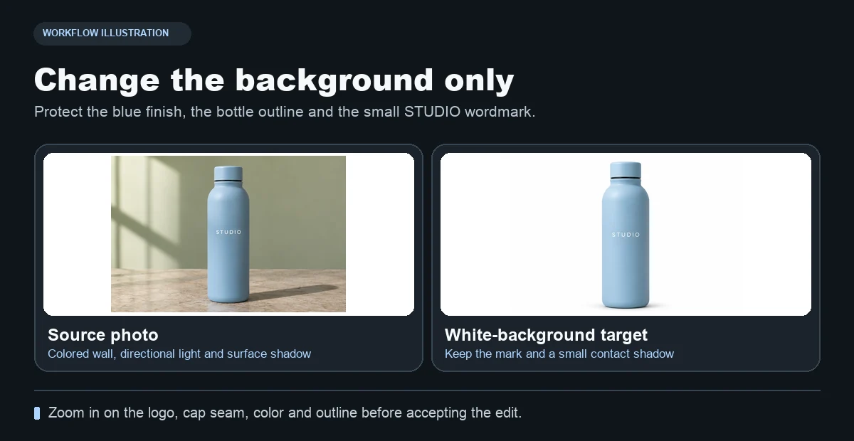
The powder-blue bottle and its STUDIO lettering are the points of comparison as the backdrop changes.
1. Choose a source photo that shows the edges
Start with a sharp photo in which the entire item is visible, including the handle, cap, corners, or base. Give the product enough space around the edge so the editor can separate it from the backdrop. Photograph clear glass or glossy materials against a simple background where you can see the outline and reflections.
Keep one unedited copy. If the original label is out of focus or hidden by glare, take a clearer photo first. A good input gives you something concrete to compare against and reduces the chance that a small word or logo gets filled in inaccurately.
2. Describe the background and the parts to preserve
Open the white background workflow and add the product photo. Start with the current preset closest to your use case. A flat white image is useful for a uniform catalog. In the bottle illustration, use the cap, the outline of the base, and the STUDIO lettering as three fixed details. A faint contact shadow can help show where a solid object sits on the surface, depending on your publication requirements.
Try this prompt for the flat version.
Set the backdrop to pure white (#FFFFFF). Keep the original product in the same position at the same size. Preserve the exact product color, shape, material, label, and lettering. Keep the outer edges clean and remove background clutter.
For a grounded alternative, keep the rest of the prompt and add “Retain a small, faint contact shadow immediately below the base.” Generate the two versions with the same input and framing so you can decide which works in context.
3. Compare the edited image with the original at full size
| Area | What to look for |
|---|---|
| Silhouette | Cap, handles, corners, and fine edges keep their original shape. |
| Label | Words, logo shapes, colors, and spacing match the source. |
| Material | Metal still reflects, clear plastic still reads as clear, and matte surfaces keep their texture. |
| Backdrop | Empty corners and the spaces around the product are consistently white. |
| Shadow | Any retained shadow stays near the base and looks like contact with the surface. |
Zoom in on the label and edge. Use the eyedropper in your editor to sample open background areas if the destination requires a specific color. Check the image as a thumbnail too. The size and placement should make sense beside other products in the same listing.
4. Save an approved version for the catalog
Export or download the approved result and open that file once. Compare it with the unedited photo before submitting it. If the label changes during the edit, try a clearer reference or preserve the actual product cutout with a conventional mask in your editor. Check each SKU separately even when the photos use the same backdrop and prompt.
For creative campaign portraits and deliberate lighting variation, use the AI Photoshoot guide. Keep the neutral product image as its own master so you can use it again across listings.